Giving the EF Class shop front some much-needed love
The problem
When I first joined EF Class, we were having somewhat of a renaissance in our design library. With our web team working hard on building out a component library of reusable elements of the product (and iOS having just completed theirs), we were poised to strike back against the Middle Ages and use this opportunity to bring some of our UI to Modernity.
The product team had compiled a bank of teacher feedback from calls, interviews and observing lessons where the product was used, and we found that our users were confused by the concept of a ‘Dashboard’ we had forced upon them. New and old users were opening the application and being greeted with a random hodgepodge of features and CTAs in a section we’d generously named the ‘Dashboard’. In reality, what we’d done is confuse ourselves and users with a landing area that did nothing more than show them a bunch of random jumping off points to other areas of the product, mostly in a much more compromised form than if they’d just navigated there themselves.
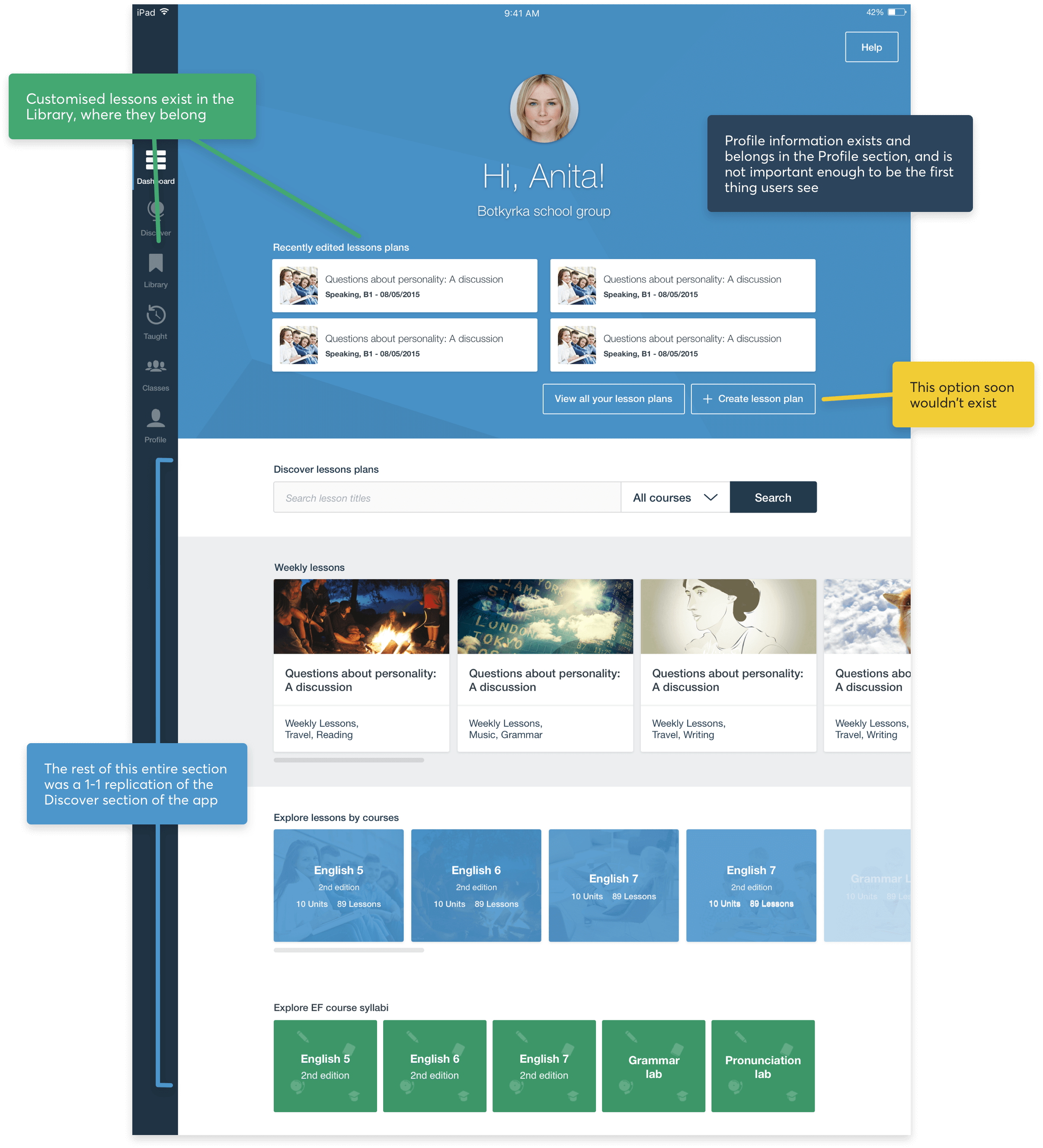
We’d duplicated so much random information into one place that we’d even managed to confuse ourselves
Confronting this mistake
EF Class is effectively a vehicle for amazing English language lessons, and we were not doing that justice one bit. When you open up any other content delivery platform, you are immediately, almost without exception, taken straight to the content you’re there to see. Makes sense, right?
Think of Netflix, or the Guardian website, or BBC iPlayer, or Hulu, or whatever. You go there, you see the content straight away. They advertise the latest or best in a prime spot, and they section the rest based on category or audience. We weren’t really doing any of this. In some cases, we were doing the opposite.
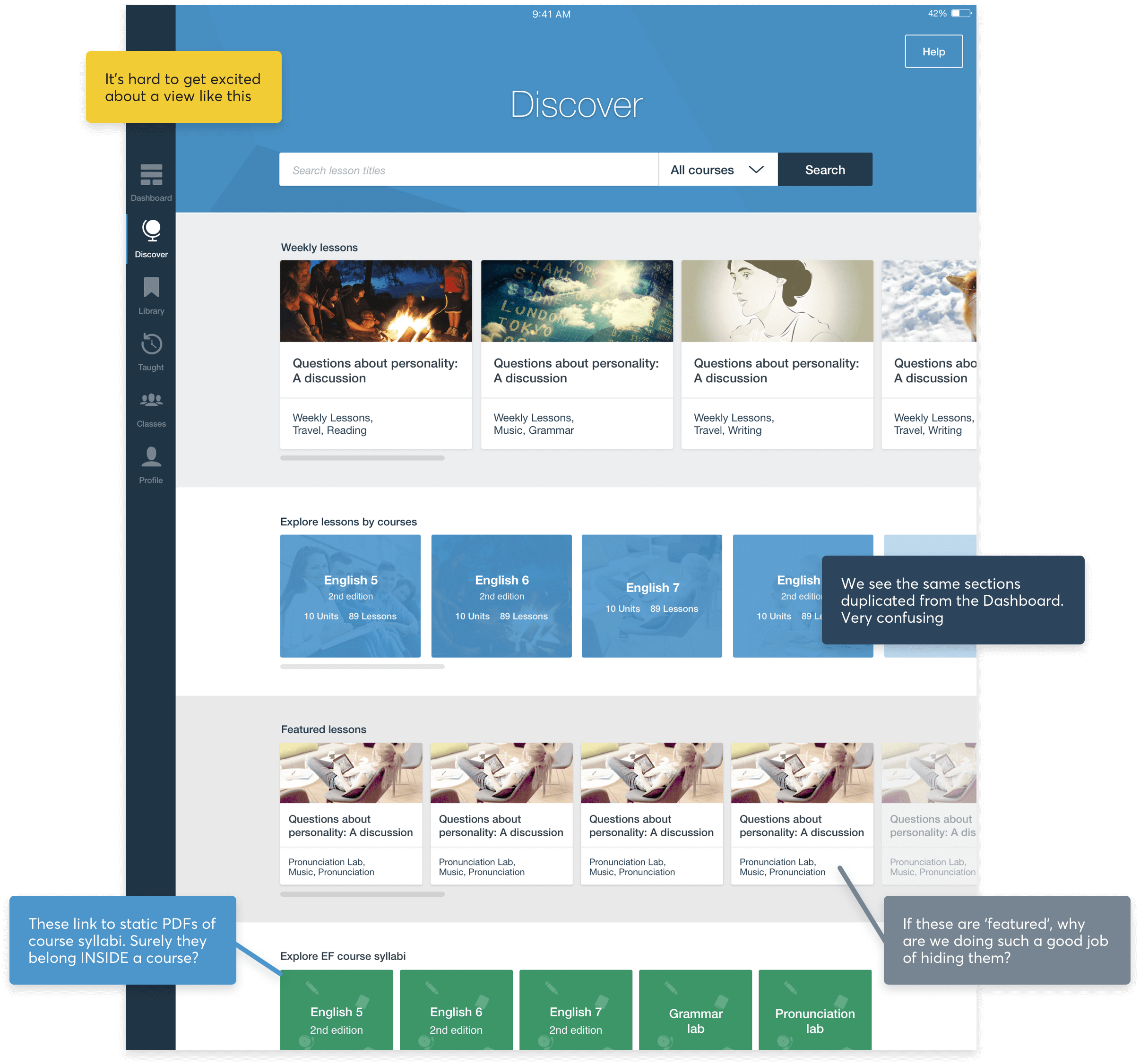
Okay, so you’ve made it past the dashboard. Now what? What here is calling for your attention? Does anything at all stand out and scream ‘Teach me!’? How are you supposed to know the full extent of the courses? Are you to assume that the only lessons in EF Class are what exist in these small carousels?
In doing this, we were also neglecting the mental model of around 80% (based on interviews) of teachers who came to EF Class. Sure, a lot of our teachers find content based on Course, Skill, or CEFR (language ability) level, but more often than not they wanted to see the latest ‘contemporary’ lessons in the product and run with those.
Working with a mixture of our research and gut feeling, we began to draw up a list of frictions and hypotheses to design for and test. In my opinion, this was aided by having two fresh sets of eyes on the project: both our PM and myself had only joined EF Class a month or so prior, so we were pushing harder for radical changes.
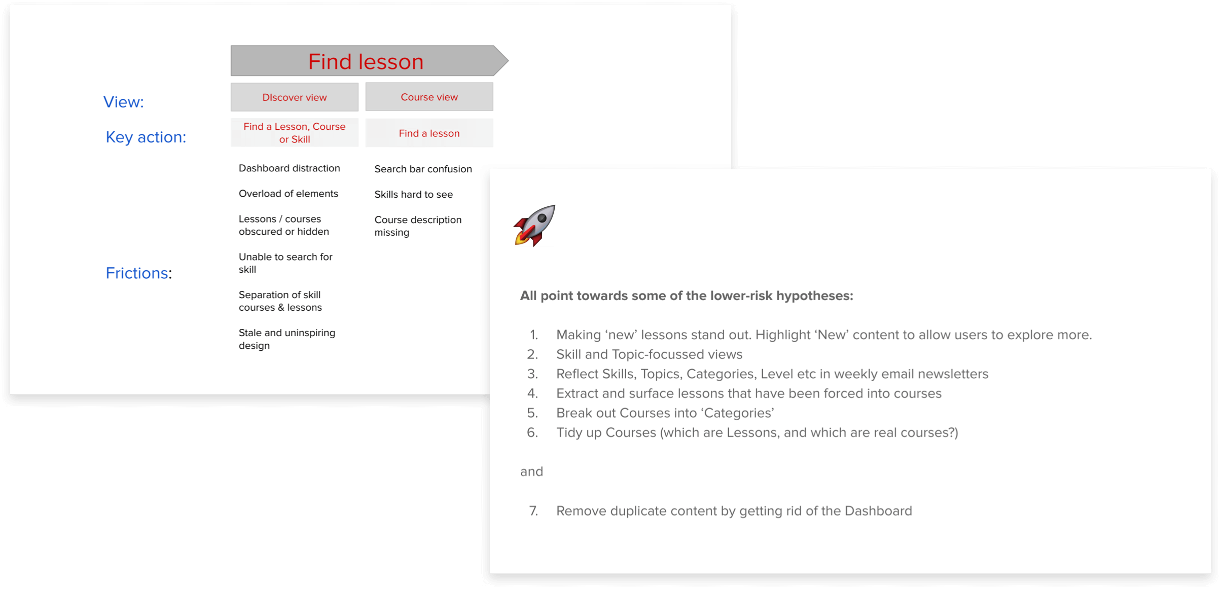
The initial set of hypotheses drawn up from a mixture of research and gut feeling
Starting at the end or: How I Learned to Stop Worrying and Love the Information Hierarchy
Okay, so we had a major issue with our information hierarchy, and this was reflected heavily in our hypotheses. The first thing to do was agree on a new structure for our ‘shop front’ – this would be the first thing that teachers would see when coming into the product, so we had to get this right. We knew that our ‘Weekly lessons’ section of hot n’ fresh new content was the killer here, and that everything else would likely benefit too from being given the space to exist in its own section.
However, this information hierarchy bled all the way down from the structure of the content’s layout to the individual components making up each section – for example, headers inside our ‘Courses’ or ‘Skills’, or if you want to get even more granular, down to the information we were surfacing on the lesson cards themselves.
We also knew that giving this a better structure granted us the opportunity to surface different things at different stages of the academic year – where before, we’d be relying solely on marketing emails to direct teachers deep into our product to find things like ‘Exam practice’ content around March or April – now we could keep the ‘Home’ of EF Class dynamic by pulling any type of content out, front and centre, whenever it was relevant.
Gettin’ going
First, we remove the Dashboard tab entirely
As we know, this area exists only to direct teachers to other parts of the (quite small) product. This causes issues in three main ways:
- It creates the illusion that the product is way more complicated than it is
- It adds another 20% of ‘area’ to the product – more cognitive load, more to get confused by
- It doesn’t direct users to our ‘shop front’ to see our amazing content – the reason they’re here in the first place!
Next we create a real sense of hierarchy
We bin single-use code and create components for everything. Aside from all the tech debt we were eliminating, the main benefit of this from a product point of view was that, with little help, almost anyone could now go into our CMS and change whole sections of content in a breeze.
We made sure that the three fundamental sections of ‘Discover’ were stacked into appropriate sections. The rationale behind this was simple: ‘If I am here to browse, I want to see the latest or most interesting content EF Class offers’, vs. ‘If I am here to find a specific Skill like ‘Listening’, or a Course from my curriculum, I want to be able to locate those sections easily’. We used things like colours following teachers around helped to provide visual reminders as to where in the app they were.

Making sections like 'Skills' feel either more loose and open to all, or giving sections like 'Courses' visual treatment to make them feel more authoritative and representative of the national curriculum. This is a long way from only having these accessible behind a tiny carousel… which, on top of everything else, gave a poor experience on web and mobile devices.
We applied the same thinking to the headers of other pages in ‘Discover’, too. Building components for these allowed us to bin even more single-use code, and more importantly, surface or hide particular features that deserved to be present in different areas.
Previously, when opening a ‘Course’ or ‘Skill’, you would be greeted with the same header you’d seen in the ‘Discover’ section – most worryingly with global features like the ability to search all EF Class lessons. Instead, we took this as an opportunity to guide the teacher with helpful cues on the types of lessons they’d find in each section, setting their expectations.
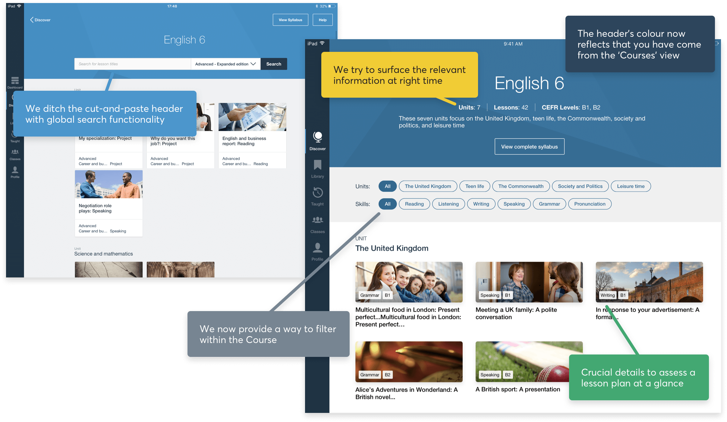
Previously, when opening a ‘Course’ or ‘Skill’, you would be greeted with the same header you’d seen in the ‘Discover’ section – most worryingly with global features like the ability to search all EF Class lessons. Instead, we took this as an opportunity to guide the teacher with helpful cues on the types of lessons they’d find in each section, setting their expectations.
We redesign the Discover tab to be the ‘shop front’ EF Class teachers deserve
Using cues from the new design language slowly being rolled out across all EF’s global companies, we work within tech limitations to design and build the first iteration this area has seen in many, many years, bringing it into the current century.
We also took into account the types of devices teachers were browsing on, and settled for something that reflected the best qualities of iOS native patterns and behaviours but which we could also apply to web devices – reflecting changes in a lot of Nordic schools, as teachers were browsing more and more frequently on Chromebooks over iPads.
Like I said before, this meant we could highlight cool lessons at different times of the year, prioritise certain lessons by giving them our ‘large’, eye-catching treatment, and make the most recent material our ‘hero’ lessons. This is a far cry from the previous layout of static, homogeneous lesson cards which did not draw any attention to featured content at all.

Our whole new shop front, built to guide the different types of users we had to the right places with ease. We took the opportunity to shine even more light on our ‘Editorial picks’, rebranded from ‘Featured lessons’. This helped give the whole ‘Weekly lessons’ section more academic weight, as we made it clear that our academic team were hand-selecting these lessons
Did all this work?
Unfortunately, two or so years ago we were not as data-focussed as we became (you can read more about how I helped guide that journey here), so we did not have anywhere near the same insight into our funnels that we have today.
However, using our rudimentary tools like Google Analytics, we saw an uptick of lesson plans being selected and taught that was growing much faster than our organic user base growth. In terms of anecdotal evidence, every test we ran for these new flows and visuals came back overwhelmingly positive, and we heard endlessly from teachers about all the great work we’d done making it easier to use and find the content.
