
Sections:
→ BACKGROUND
→ SOLUTION
→ RESULTS
Reducing support calls by 55% through design interventions
PURPOSE
Create a better experience for both our external and internal customers without trade-offs.
ROLE
Lead Product Designer
BACKGROUND
LendInvest has market-leading technology, for which we are always nominated for or winning awards. Both brokers and LendInvest save time, money, and effort thanks to our smart automations, elimination of paper forms, and dramatically reduced communications.
RESPONSIBILITIES
As design lead I drove the initial research, presented a case for the insights, designed the final experience, and aligned product, tech, and stakeholders on a delivery strategy. I oversaw other product designers’ contributions to the project and drove the marketing and data efforts.

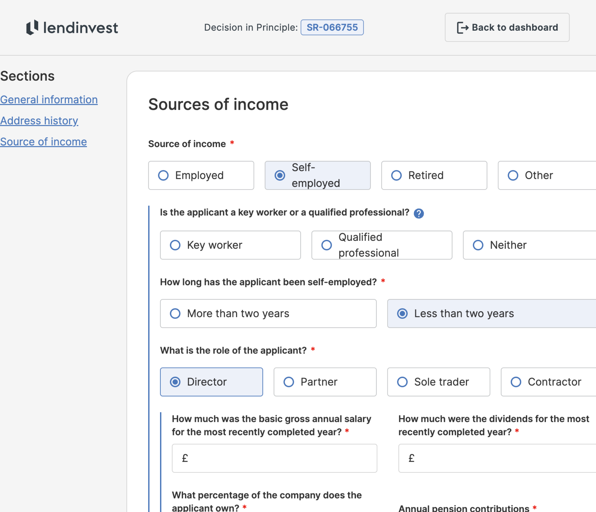
Some unfortunate examples of the layout breaking for our users.
ISSUES
The LendInvest Mortgages Portal was originally designed under the stakeholder assumption that brokers worked exclusively on desktops. Post-launch data revealed otherwise: 41% of brokers resized browsers or used smaller devices, breaking layouts and making forms unusable.
We speculated this was because they’d pull up their fact-find docs, or CRMs, or however they managed their clients’ information – something which was later confirmed during discovery interviews and visits to brokerages.
This created significant usability issues, with inaccessible inputs, broken layouts, and heavy cognitive load through poorly-laid out questions. We’d see a lot of inbound call traffic from brokers who were stuck mid-way through an application.
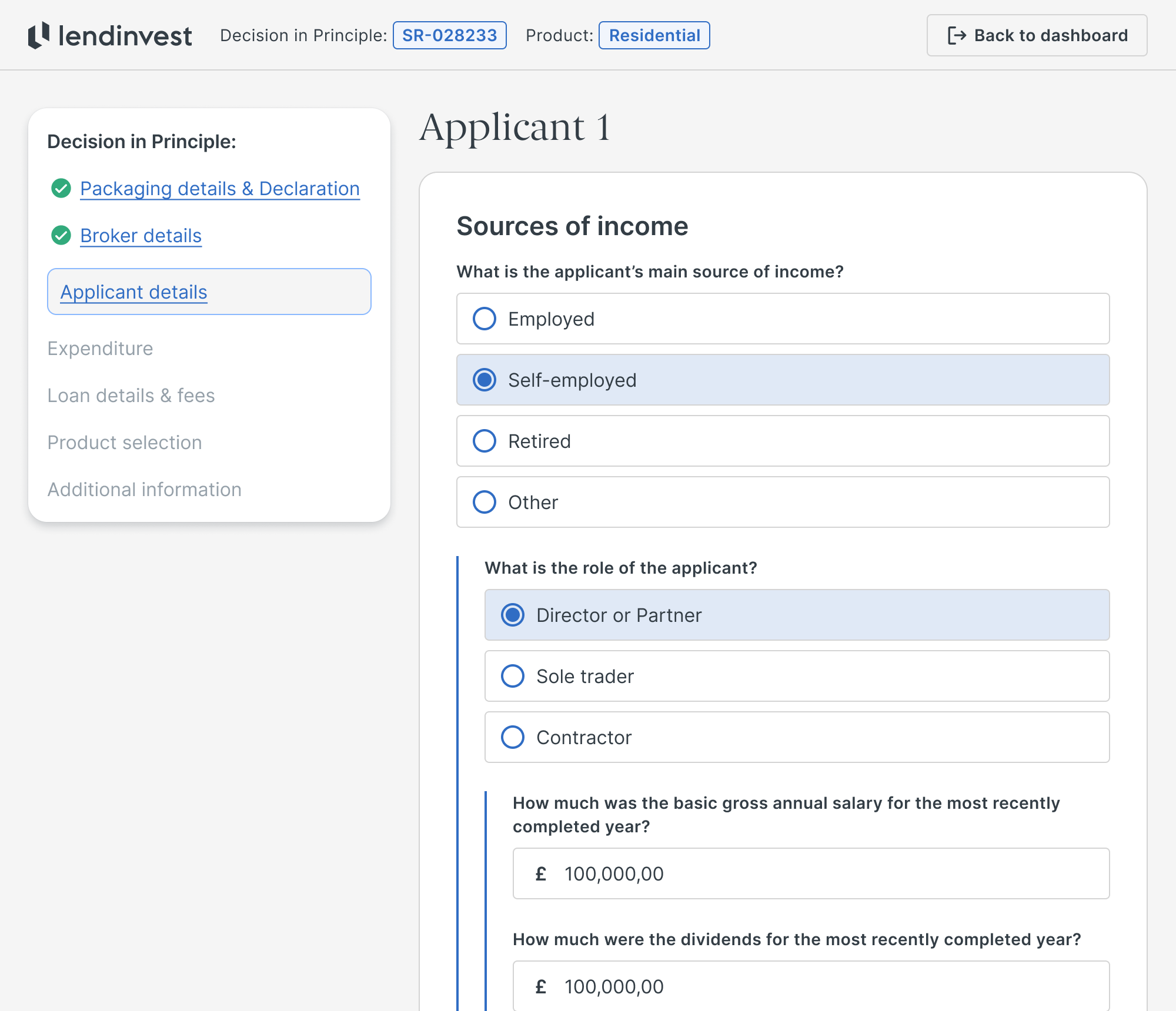
THE APPLICATION FLOW
We redesigned the application journey around a single-column, fully responsive design system. Whether it’s across usability, accessibility, confidence or maintaining less technical debt, single-column always beats multi-column forms. CXL ran a study where they found users took 15.4 seconds less to complete the same form across these layouts.
Using progressive disclosure and conditional questions, we went further to prevent applications from seeming overwhelming, while cutting the required questions by ~30%. By collaborating with stakeholders we ensured questions were properly structured and grouped more sensibly.
A more targeted set of questions would also ensure that less following up was required by our internal staff, so they could spend more time on service and judgement and less on paperwork – making the process quicker, simpler and far less stressful for everyone involved.
THE APPLICATION OVERVIEW
Beyond this initial work we targeted areas that saw lots of support requests and therefore required further enhancements, such as our application Overview page – the most important point of the broker’s experience outside of inputting data.
We discovered that brokers struggled with understanding where their applications stood in their journey to completion, if they had anything outstanding which was blocking the progress, and where to find more information about these applications.
Learning what was needed from ongoing discovery interviews allowed us to refine our ideas into some key concepts, and usability tests validated which direction would serve as the final design.

We took this as an opportunity to reevaluate the stages of completion we presented back to the broker, including how we group and frame tasks within the context of these stages.
It became clear that brokers valued being able to see messages from their underwriters within the context of their application’s progress, and with any tasks they might be related to.
Building this way allowed us to continue with our new design language, ensuring that everything was optimised for any screen size and with the goal of ensuring the broker was informed as well as possible.

THE RESULTS
11%
reduction in time to complete an application.
41%
of brokers benefited from the responsive layout.
5%
lift in conversions on highly-performing enquiry forms.
55%
reduction of inbound support calls related to applications.
In the six months after the release, 41% of users benefitted from the responsive layout with a third fully adopting smaller devices – something that hadn’t been possible before. Most notably, inbound support calls related to the application flows dropped by 55%. By cutting unnecessary questions and making forms accessible on any device, brokers were able to complete applications independently.
