

Bridging the gap between young rap fans and the UN SDGs
Search Party’s background
In 2015, the UN launched their Social Development Agenda, made up of 17 global goals for sustainable development. These aspirations lay out a vision for a fairer, safer planet before the year 2030. It’s hard to appreciate how much better living on our planet would be if we managed to complete this list, even if we did it in twice that amount of time. What’s even harder to appreciate is how we are all responsible to make this happen.
About the project
George the Poet is a British BRIT and MTV award-nominated spoken word artist and rapper, with a strong interest in social and political issues. Born of George's frustration towards inaction, and his want to mobilise his audience into working towards these goals, came the Search Party app.
Working directly with George the Poet, myself and the team at Super Being strategised, designed and built the Search Party app; something to bridge the gap between George’s words and his audiences’ actions.
What were we trying to solve here?
George had seen traction within his audience whenever he uploaded a spoken work piece to YouTube or on Twitter and guided them towards a petition or initiative that targeted a particular UN SDG. However, we saw that his audience often were stuck with ideas on how to get involved, and what their first jumping off point should be.
We saw this as an opportunity to link bespoke pieces from George to his preferred ways to get involved with the cause the piece was speaking of, and planned a small mobile web and iOS app where we could collect a special series of George’s (and eventually, others’) poems, spoken word pieces, and videos and their relevant causes.
The product was designed to mobilise George’s audience in a way that generates traction towards solutions for real-world problems.
Gathering initial research
Research into George’s audience and the SDGs he wanted to target led us to some points we needed to address when strategising and designing Search Party:
- People aren’t aware of these causes
‘The SDGs are a huge agenda for action amongst the people of this planet. How is it so many people in George’s switched-on audience are unaware or not doing anything to help achieve these goals? How can we inform them and pique their interest?' - Users need to be kept engaged
‘How do we get George’s followers to use the app in the first place? What makes it special for them? Why would they continue to come here?’ - We need to educate the users
‘How do we get these users to understand the importance of their actions – on a macro and a micro level? - We need to mobilise the users
‘Great, the users now have a better understanding of what’s at stake and how they can help. How do we get them to actually do anything?'
We understood that creating a mobile app first was probably the lowest cost in terms of retaining and notifying users – creating a web experience effectively did the same job as George posting on Twitter or YouTube, whereas creating a semi-captive audience with a native app meant we could easily notify them of new releases and goals.
Mobilising the users would be fairly easy – we would give them a few tiered options for each cause, and track their click-through progress. As far as keeping them engaged, short term the goal was through a lot of initial exclusive-to-app content, and eventually once we had confidence to build user accounts, we could award points to users for offering their time or resources to these causes – rewards which could be traded in for discounts on tickets to see George and others in the future.
Defining the initial scope
For the purpose of keeping this as simple as possible to build and maintain for both us and George, we settled on a simple, heuristic structure with very linear paths from landing page to action point, and back again. Once we had proven the concept with organic signups, retention and activation (initially, opening external links to resources), we could then look into developing user accounts and applying ‘Flame’ points – awarded when a user completed an action.
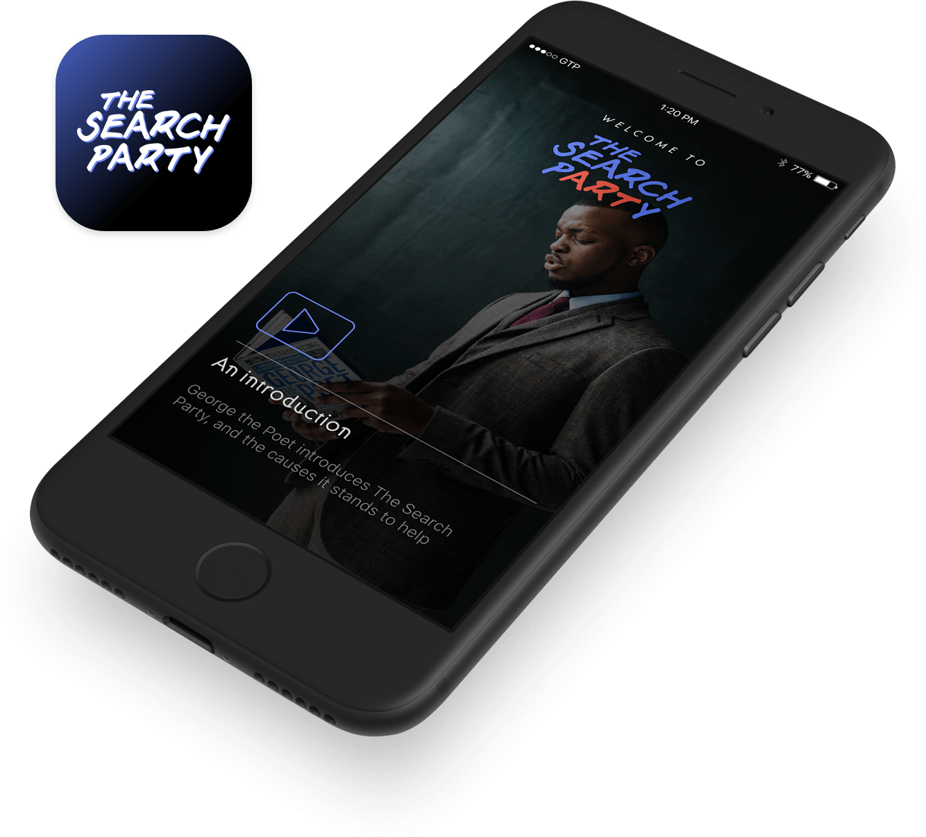
We knew that, with a product that doesn’t yet gather any personal information or have any intrinsic value in the lives of our users, we really only had one chance to properly education them on what to expect and what the goals of the product were. We therefore decided to forgo the prolific ‘onboarding slides’ trope and instead have George personally deliver a quick message to new users to thank them, and excite them for what was to come:
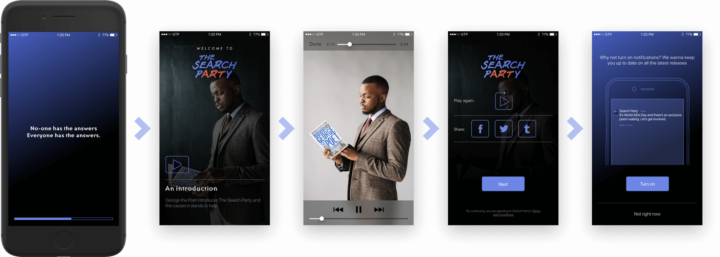
Carving out the initial User Experience
As mentioned, users would be able to read through a bank of mostly exclusive works, and take action based on their causes. Aside from this, users would get to read more about the piece’s personal meaning to George, acting as a jumping off point where we’d offer three options: ‘Sign Something’ (like a petition); ‘Do Something’ (like give to charity); or ‘Start Something’ (like a social enterprise), encouraging users to step out of their comfort zone into the world of social action.
To keep things simple, we also agreed to stick to as many native patterns as possible, overlaying them with a style unique to the product.
Prototype made with Marvel – if this embedded proto doesn't work, you can see the original here 
Creating a design system
We had three main goals when creating a design system for this product:
- Make it uniquely ‘Search Party’;
- Create a sense of empowerment while inspiring people to take bigger actions;
- Keep it as reusable and as native as possible
Taking cues from the Atomic Design methodology popularised by Brad Frost at the time, we built out everything from the most granular levels first, through to templates of entire layouts to ensure everything could be reliably reused with little intervention.
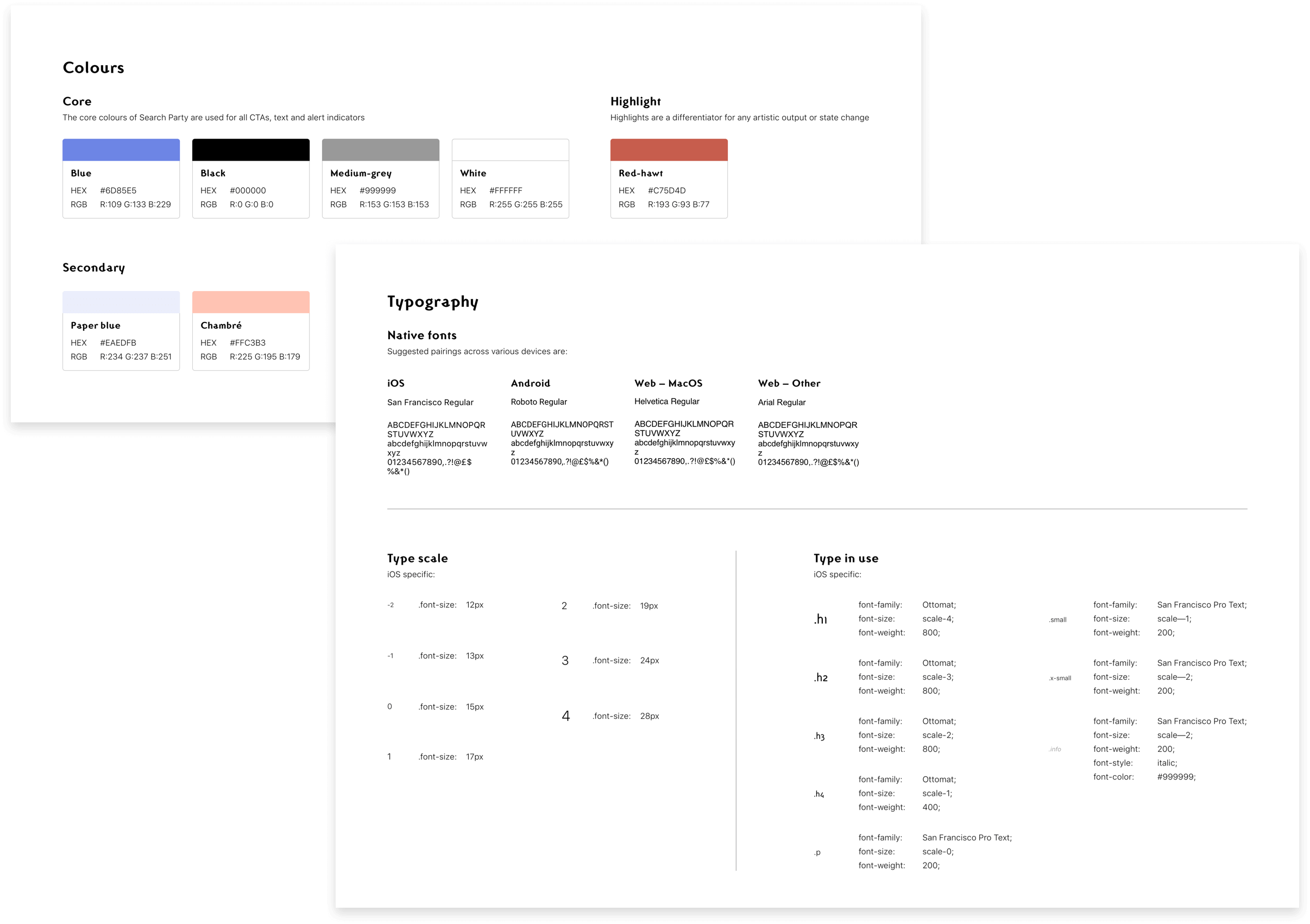
Starting with the fundamentals – ‘Atoms’
In the case of Search Party, this meant defining a colour library and font set, as well as a font scale which would allow us to transpose this initial iOS work across to Android and even web.
To continue the ‘moody’ aesthetic we’d developed during the branding phase, we pushed towards a simple scheme using stark colours. This was before ‘dark mode’ was a standard feature on shipped iPhones, and created a huge contrast between Search Party and most other apps.
The same applied for the type scales; we wanted something that could be easily ported to other devices and retain accessibility, so we chose to stick with native iOS fonts for the large part, and only use Ottomat, a font designed to be both accessible through use of geometric forms, while not being ‘neutral or bland’, a common theme with other geometric fonts.
Each ‘atom’ had to feed into a wider system of ‘molecules’ and then further into templates and entire experiences, so we had to make sure that they passed colour and size accessibility standards.
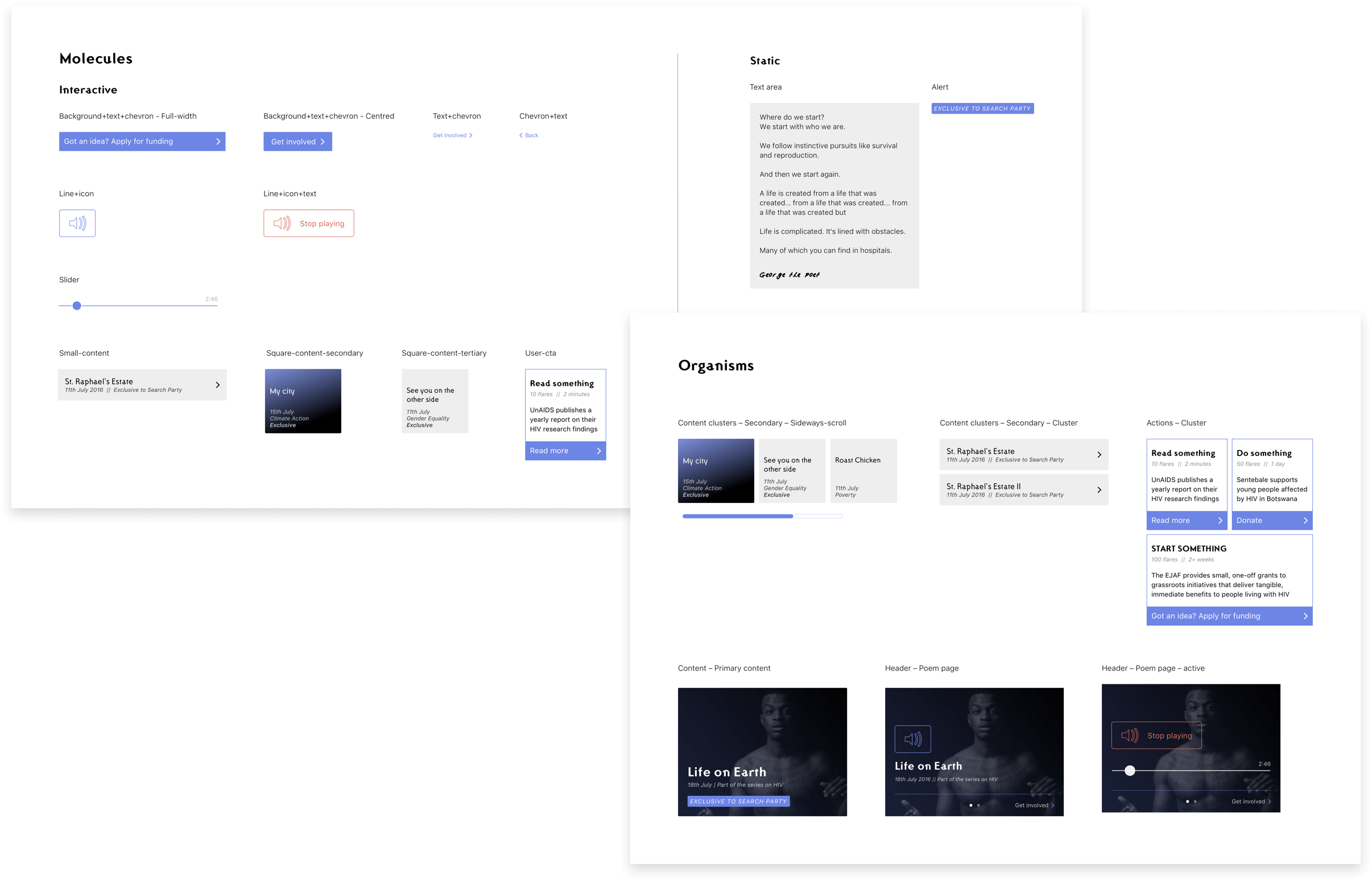
‘Molecules’ and their patterns
We tried to keep everything as native to iOS as possible, employing standard patterns like UIButton (pairing a native icon like a chevron + text) for navigational purposes, but employed more authoritative, striking options for major user actions, like following a ‘Sign something/Do something/Start something’ suggestion.
‘Organisms’
As we got further along in this process, the patterns defined at the ‘molecules’ phase meant we could design and create entire ‘organisms’ of UI elements quickly and efficiently. Defining a uniform set of margins within these ‘organisms’ was crucial to ensuring they could be filled automatically within a CMS, and display properly in the app.
'Templates'
Finally, as we’d defined everything from the micro to the macro stage, we were in a position to begin assembling entire templates.
Outcomes
As the lead product designer on the project, I liaised directly with the client, initially guiding strategy and helping refine the project scope, and eventually undertaking market research.
After this process, I was responsible for creating user flows, guerilla testing wireframe prototypes, and eventually high-fidelity visuals. My role also saw me directing branding and creating a custom typeface for the project based on George's handwriting.
Within the team at Super Being, this was a great opportunity to prove the value of building out an ‘Atomic’ style reusable design system from the get-go, and helped encourage developers and designers to begin speaking the same language as far as collaborating was concerned – something which is often tricky within an agency setting, where speed of delivery is often valued over longevity of the technical side of the work.
Personally, this was a great project to refresh my mind on all things native-iOS, and how we can flirt with native expectations in a way that helps create something which is equal parts accessible and familiar, while maintaining a strong personality and depth of feeling of its own.
