Simple tweak, big impact: A 27x lift in teacher activation
Simple tweak, big impact: A 27x lift in teacher activation
PURPOSE
To encourage new teachers to complete the core loop of registering, browsing content, and delivering their first lesson
ROLE
Product Designer
BACKGROUND
EF Class is an EdTech platform that gives English teachers ready-made lessons they can deliver in class, or send as assignments. Its success depends on teachers not just signing up but actively teaching, reviewing, and setting assignments.
RESPONSIBILITIES
I worked with a Product Manager and Technical Lead to shape the process end-to-end: identifying the problem through data analysis and interviews, framing the hypothesis, creating prototypes, and validating them with teachers and students remotely and in-situ across Sweden before launch.
ISSUES
Through repeated usability tests (with both new and existing teachers), we saw friction around understanding their teaching options.
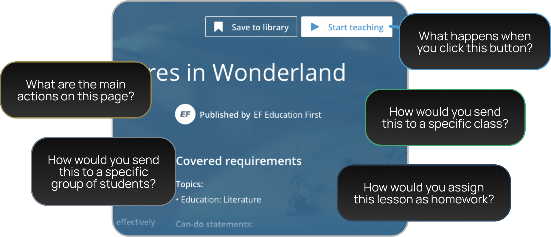
Teachers told us they felt lost at the very first step. The ‘Start teaching’ button would open a modal that gave multiple paths – teach live, send an assignment – but offered no guidance as to what happened when ‘Start teaching’ was clicked.

Understandably, teachers were anxious about committing because they didn’t know what would happen next. Funnel data confirmed it: this was our single biggest drop-off point. Marketing efforts and sign-ups meant little if 98% of teachers never got to their first lesson.

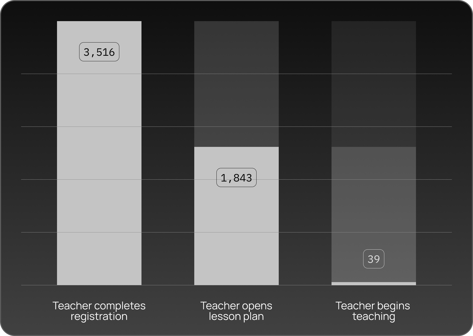
Of the ~3500 teachers that registered in a six month window, ~55% opened a lesson plan after browsing. Of this step, 2.2% of these users started a lesson. That means 1.1% of all registrations within this period completed our core loop.
THE SOLUTION
Presto chango! Out with the modal, bring in the wizard. We scrapped the cliff-edge button and introduced a nicer hover state option to begin the new ‘Teaching options’ flow.
Each path had a clear label, visual cue, and short description of what would happen next. We softened the copy, and softened the visual language too; updating our design system with cleaner icons, a friendlier UI, nicer colours, and micro-animations. All small details that take the edge off.
Behind the scenes we validated every stage with usability tests – in which teachers consistently reported more confidence – benchmarking the new flow against the old one.

THE RESULTS
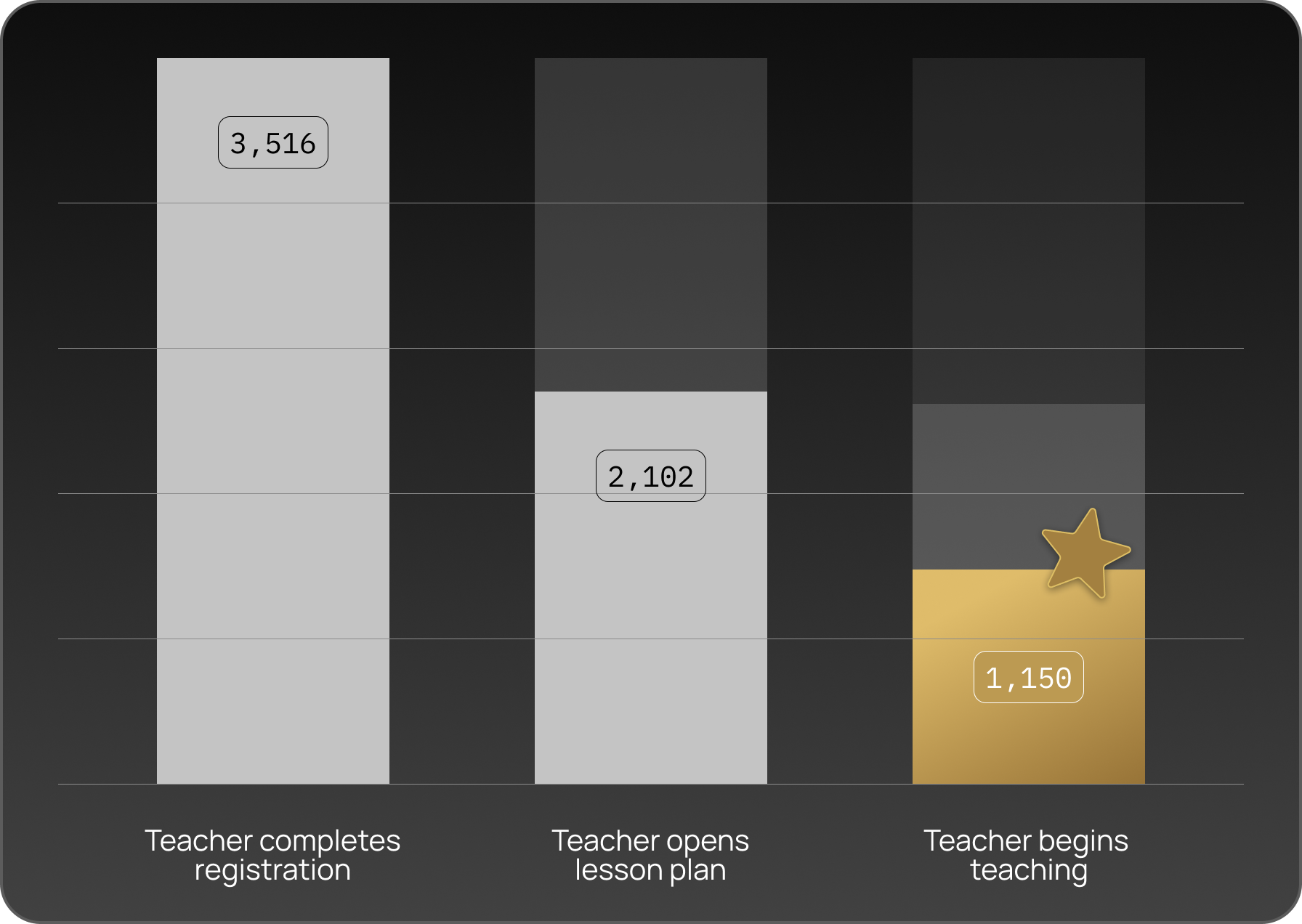
The change transformed our metrics. Within six months, 29.6% of teachers taught their first lesson, compared with just 1.1% before. Without cannibalising the core metric, assignment usage nearly doubled, since teachers finally understood the option.

The redesign also left us with a scalable foundation: future features like Quick Start and Projection slotted neatly into the new flow, without adding complexity.
Most importantly, it reminded us that the very first click matters. By making teachers feel informed and supported at that crucial entry point, we turned EF Class from a product people abandoned into one they actually used to teach.