Democratising after-care for breast cancer survivors
Who are Breast Cancer Care?
Every year nearly 62,000 women are diagnosed with breast cancer in the UK, and there are an estimated 691,000 living with a diagnosis.
Breast Cancer Care are a leading UK charity who are steered by world-class research and provide care, information and support to people affected by breast cancer by combining the personal experiences of people affected with clinical expertise.
What did we need to solve?
Breast Cancer Care knew that the need for support doesn't end when treatment does. They also knew that the after-care market for breast cancer survivors woefully under-resourced to the point of being almost non-existent. Whether experiencing side effects of treatment, trying to adopt a healthier lifestyle or finding it hard to make sense of their experience with breast cancer, many people find it hard adjusting to their new lives and finding their ‘new normal’.
In 2016, BCC joined CAST’s three-month digital accelerator to see how their charity could help address the profound emotional needs of women both living with breast cancer as well as those who were in remission with a low-cost, high-impact digital solution, where they were partnered with myself and the team at our tech for good agency Super Being.
Phase 1: Discovery
The BCC team were already in an amazing position to condunct customer research, as they had a wonderful group of ‘digital champions’ already in place – a group of around forty volunteering women who were on call for research and interviews, in return for gaining early access to beta versions of new initiatives.
This group was the main source of our initial research through one-to-one interviews, and they were incredibly forthcoming and candid with their stories. Everyone involved in the project is surely indebted to the insight given by these volunteers – women who had overcome intensive medical treatment and emotional stresses offering to share their experiences to build something that could support others like them.
We found that BCC’s forums were chock-full of helpful suggestions, all submitted by the truly incredible community of breast cancer survivors for the benefit of others. Hundreds of posts were being made every week to add to these.
Delving deep into the forums, on the advice of our interview group, showed us there are a lot of resources available for breast cancer patients online, but no centralised place. Cataloguing these helped us identify content areas and potential signposting destinations.
The theme that was clearly emerging was that women are often left alone for myriad reasons once they leave their final hospital appointment. As soon as they are given the ‘all clear’, women are left on their own with no resources or places to turn for advice. Another clear theme was that, because they have been discharged, they are seen as ‘better’ by friends and family, when in reality they need as much help adjusting to their ‘new normal’ as they did while they were under hospital care.
Phase 2: Testing our ideas
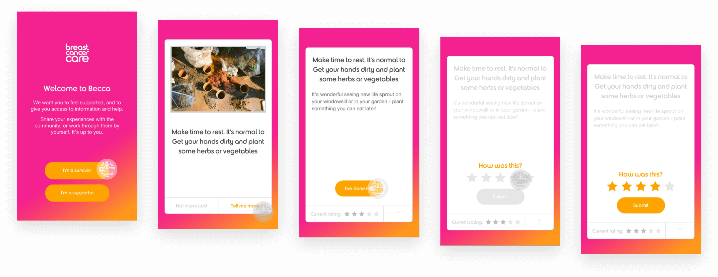
Based on this research, myself and the team at Super Being designed and built BECCA-lite, a simple web app to test our delivery method of suggestions to support women moving forwards after breast cancer treatment.
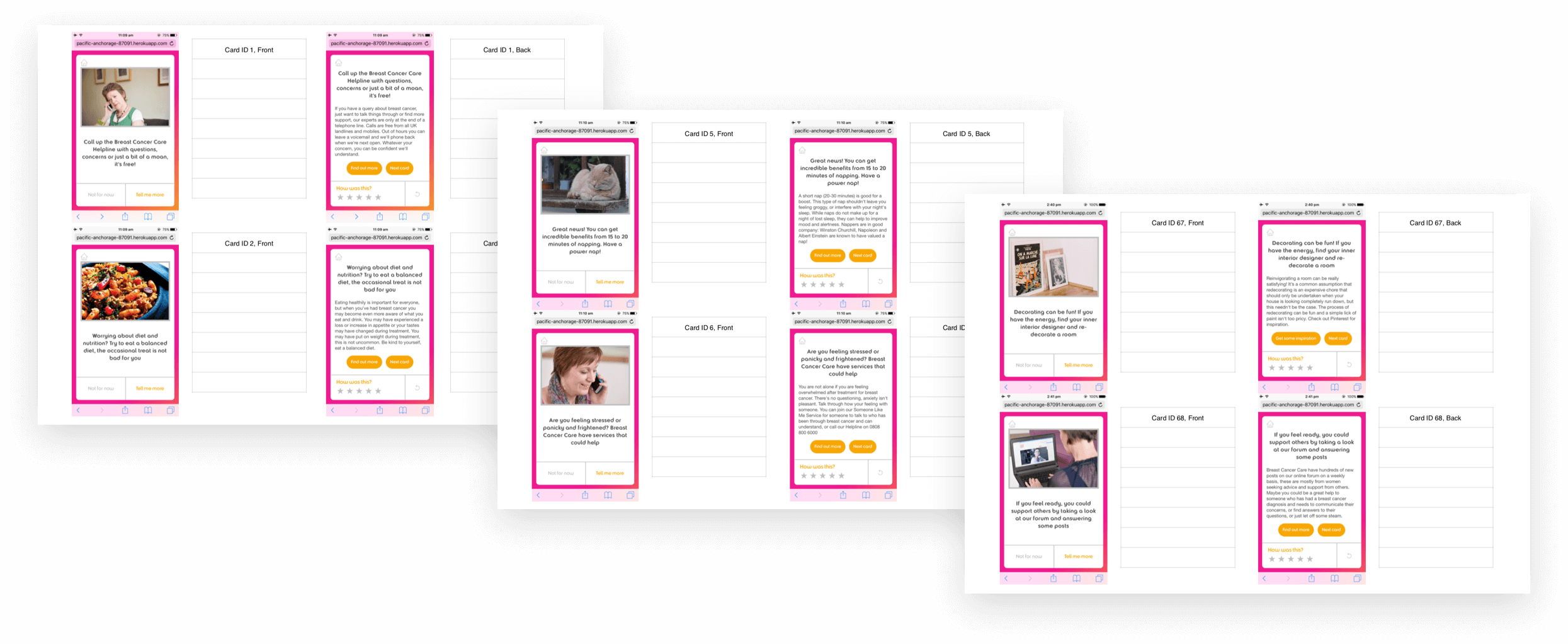
This idea was prototyped and tested with the ‘digital champions’ – on both a one-to-one and group level, using existing ‘champion’ meetings at BCC’s offices to trial our suggestions with ready-assembled groups.
The super low-cost original work on BECCA-lite, which was heavily based on BCC’s print-only brand guidelines but allowed us to rapidly test and iterate the concept. Fingerprints indicate what’s been tapped to get to the next screen.
Once we were convinced that providing a centralised place for this information was the most effective, lowest cost approach, we opened the BECCA-lite web app to the BCC forum, offering invites to a closed beta trial. Within a couple of days, we had over 1,000 women willing to take part. To us, this only concreted the need for a product like this.
Using tools like Mixpanel to track engagement within our flows, as well as further in-house testing and workshops, we were able to obtain amazing feedback, planning features that gave real value to BECCA’s users. As well as these more subjective methods, we also captured feedback on the quality of the suggestions we were providing through a rating system on the cards, split between a ‘not interested’ option and an ability to rate suggestions they’d completed out of five stars.
Manually testing and critiquing the content for tone of voice, visual appeal, and appropriateness proved invaluable.
Thoroughly testing the mechanics of the product, as well as the delivery mechanism of the content and tone of voice we were presenting it with, gave us confidence to build native iOS and Android apps that launched publicly in 2017.
Carving out the initial User Experience
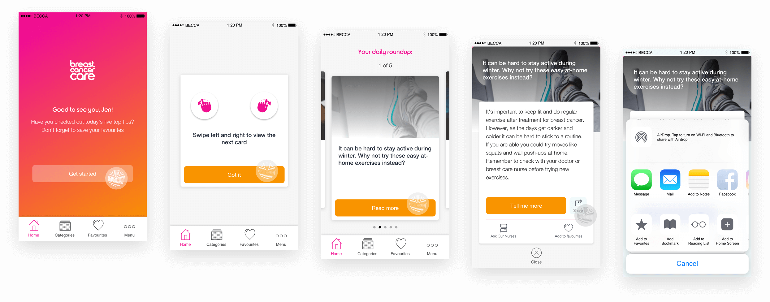
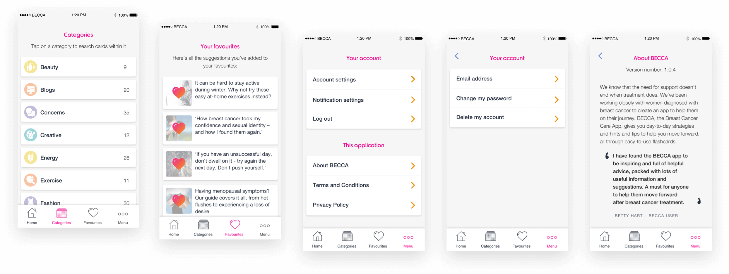
As we saw was the problem with BCC’s forums, oversaturation of information made it harder for the great content to bubble its way to the top. We wanted to surface no more than a handful of suggestions each day, offering the users five across a gamut of different themes, and allowing BCC to suggest seasonal activities as well as topical ones based on current events.
From there, users could save cards to their ‘Favourites’ section, allowing them to build their own bespoke collection of resources and tips.
We also knew that there was a likelihood of users not feeling sated by the five daily offerings, so wanted a place where they could explore by theme – it’s no use having all these great suggestions and preventing access to them.
To keep things simple, we structured a super-basic hierarchy within the app. We also agreed to stick to as many native patterns as possible, overlaying them with a style unique to the product.
Creating a design system
We had three main goals when creating a design system for this product:
- ‘Make it friendly’ – Breast Cancer Care’s existing, print-only brand guidelines revolved around their custom font, Betty, with the idea that BCC should be represented through Betty – as an informative and supporting friend;
- Create a sense of empowerment without being patronising;
- Keep it as reusable and as native as possible
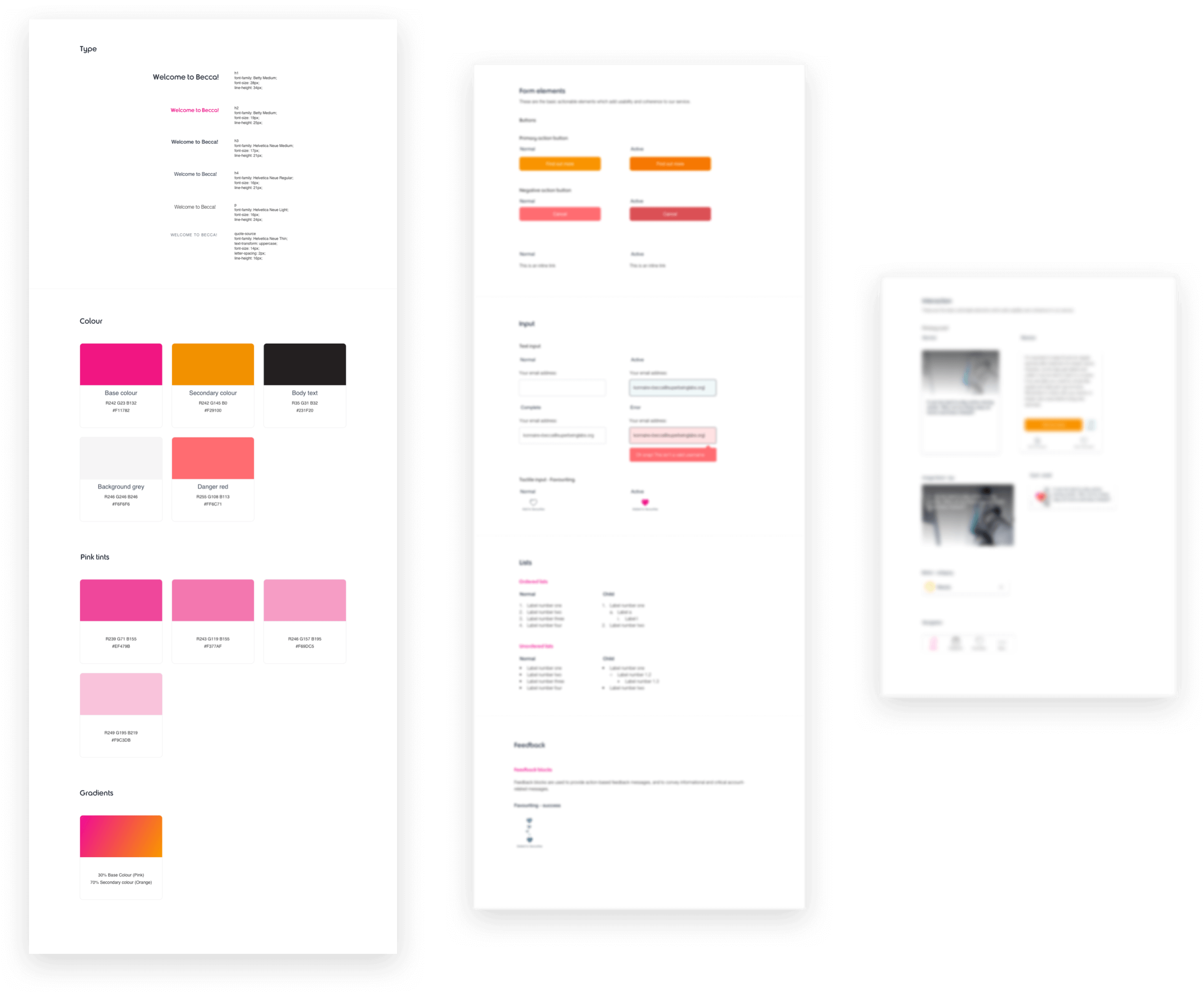
Taking cues from the Atomic Design methodology but keeping it small, we built out everything from the most granular levels first, through to templates of entire layouts to ensure everything could be reliably reused with little intervention.
Some of the atomic design system built for the application – blurred for privacy.
Building out the UI
Knowing this app was to be built across iOS, Web, and Android with limited time, we stuck brand-only design language in order to maintain platform-parity.
Past serving useful information to users, getting them to share was the primary purpose of the entry flow. Unlike most products, the aim there wasn’t necessarily to encourage others to download the app – instead it was purely a method to distribute genuinely useful information as far as possible. For that reason, we chose to backlink every share to the web app version of the product, to make it as accessible to others as possible.
Understanding our average user’s age would be above 45 and in a potentially fragile state of mind, a level of empathy had to be adopted to design a digital product for an audience that would likely have a lower level of comfortability with using smartphones and tablet devices. It was therefore important not only to stick to the Human Interface guidelines of both Android and iOS, but also to go against native patterns where appropriate, such as going several point sizes larger than the default font sizes, and increasing the sizes of touch targets.
In doing this, a simple yet rich product with only 5 different types of human input was designed.
Avoiding information overload at all costs was the goal when building our hierarchy. Having wildly different visual cues in each section of the app really helped users understand what to expect, and form patterns quickly.
Creating an easy-to-predict design language helped us inject the occasional message from Breast Cancer Care, such as when they shared stories of other BECCA users, or when they wanted to collect feedback on the app.
Outcomes
A year after the project started, it launched publicly on the App Store and Google Play, and within a few months it already had 3,600 live users. Soon after, in November 2017 BECCA was a runner up in the BMA awards 
"This is an excellent app which has been carefully designed to meet user needs. It is easy to use and well laid-out. I was impressed by the dissemination campaign and the adept use of social media."
Skip ahead to January 2018, and the app had over 7,500 users. BECCA won Best Health Project at National Lottery Awards 2018 
The app has now supported more than 20,000 people, with over 1,000 new users downloading and interacting with BECCA every month:
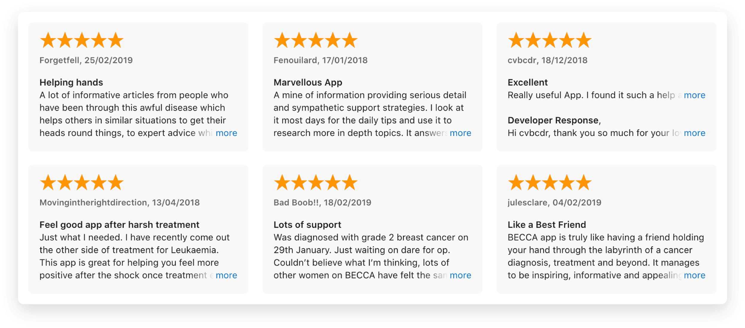
Some amazing reviews with wonderful product feedback on the Apple Store. Read more here.
Personally, this was a bittersweet product to work on. While it was amazing to be creating something for an audience who were both incredibly invested and deserving, it was hard working on something that still hadn’t really been tackled in society by 2017, digital or not. Any ‘wins’, like usage data, activation rates etc, had to be taken with a hell of a lot more reverence than on any other product I’ve worked on – these were people fortunate enough to have seen their way out of a horrible experience, but who were now left to fend for themselves and begin a hard fight for their mental wellbeing by our national health service.

