Making teachers’ lives easier by showing our potential
About the project / No two problem statements are created equally
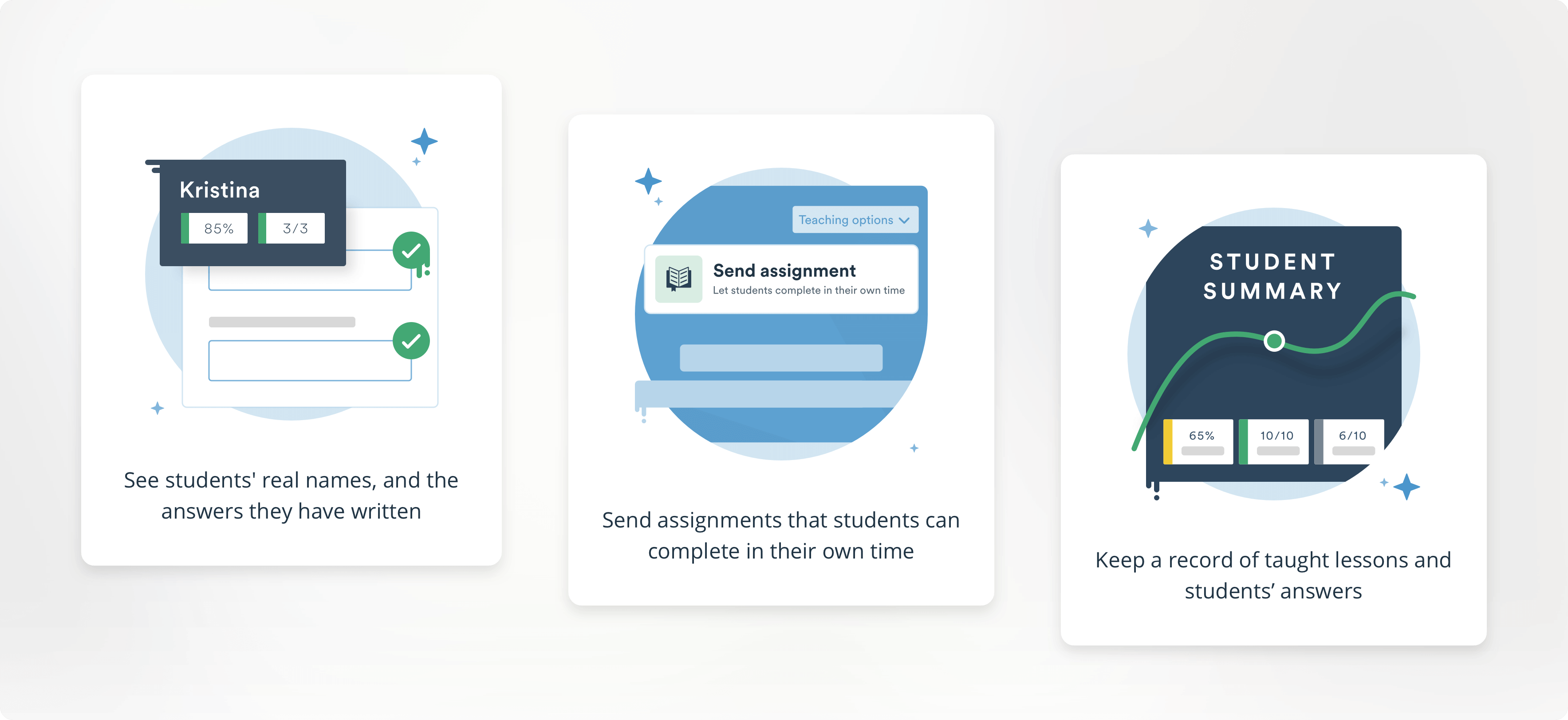
With EF Class, you can start a lesson in many different ways. Beginning a regular with a fully-enrolled, connected classroom lets you see student names next to their answers, track their score across activities, whole lessons, and over time.
Sending assignments more or less gives you the same set of tools, but you can’t queue, send, retract, or focus activities – it is intended to be done in the students’ own time, as homework.
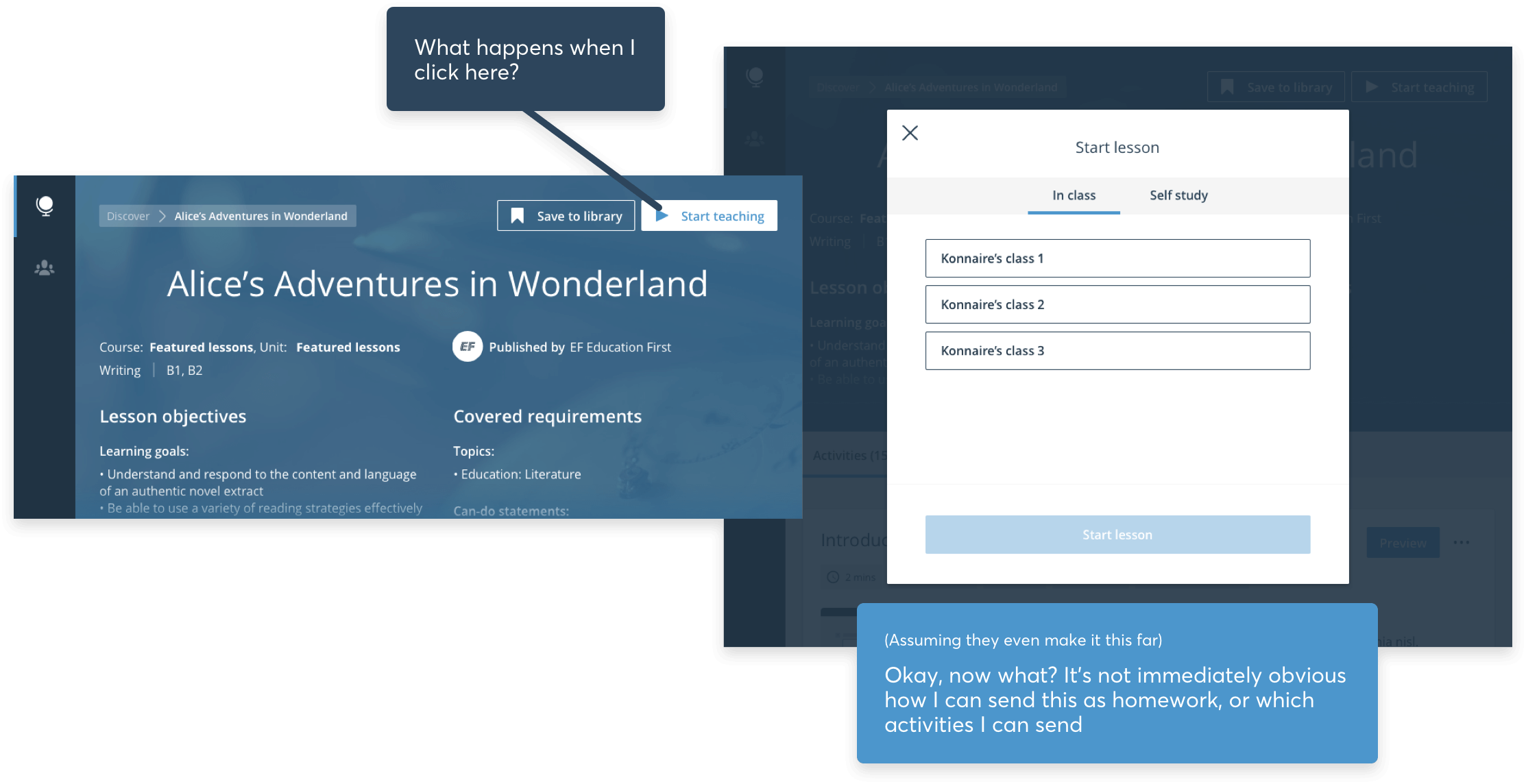
This is fairly simple stuff, but given that our existing, LinkedIn-esque modal really did not provide any context on what was what, teachers were already dropping like flies at this point. Let’s throw a major feature we were about to ship into the mix: the ability to teach with non-logged in students (Quick-start – read about that project here) and we really did have a right old mess on our hands.
We’re already hiding half of our options from teachers, and now we want to push a new feature into this space and hope it’ll succeed?
Testing our hypothesis
Now, as is ofter the case with product design, this finding wasn’t from any exhaustive research into a specific problem, nor a deep dive into our data, but rather something we’d themed time and time again across hundreds of usability sessions with old and new teachers alike. That always makes a neat jumping off point for sure – now we’re fairly sure we have something that needs attention – but how can we make sure we’re tackling the right thing here?
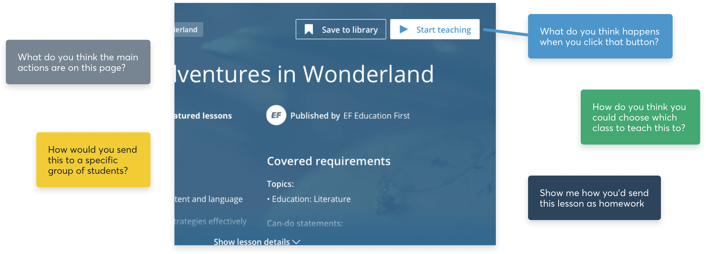
Using our research planner (heavily inspired by The NN Group’s Landscape of User Research) , we sorted by the types of data we wanted to be sure of, the types of user we wanted to test with, and the types of usage we wanted to observe, and found ourselves settled on running quick, guerrilla usability tests around the EF office using our production app, and a set of simple questions:
These were not necessarily required to be run with new and old teachers, as we were setting just enough context before each session, i.e. “You are a teacher exploring an education app for the first time. You’ve found a great lesson and want to know what your options are to share it with your students”, and testing something we saw as purely usability-focussed, with tasks like “Show me how you’d send this as an assignment, instead of with a live class” or “Show me how you’d share this with a class if you didn’t require them having accounts”. Plotting this against the anecdotal data we’d collected from previous sessions, we found a direct correlation between our results and the feedback from our teachers.
Not only this, but the general consensus was that out testers were anxious as hell about pushing a “Start teaching” button that offered them zero guidance on what would happen next. Makes sense, right? Who in their right mind would choose to test a product when they have no idea what their options are? Performing this action with confidence demands a ton of upfront knowledge about what your options might be at this jumping off point – options which were not explained to teachers anywhere leading up to this… and these were people vaguely familiar with EF Class and what it does. We suspected this was a huge blocker for new sign-ups who were yet to teach their first lesson.
Diggin’ into our funnels
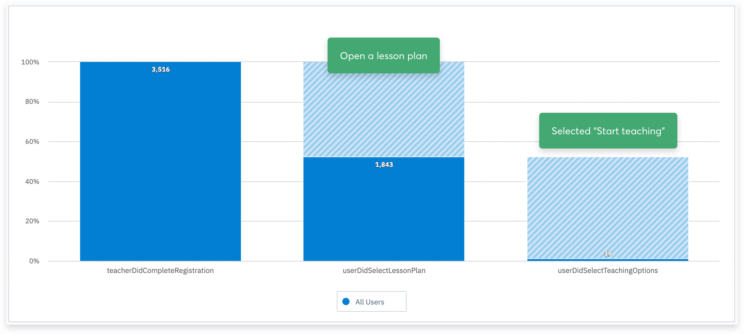
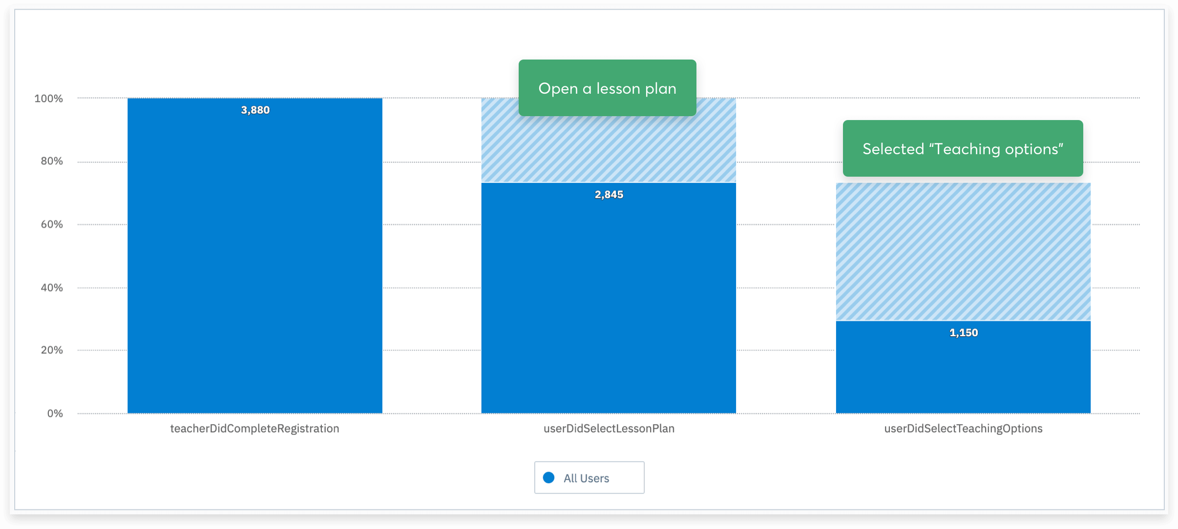
So on a hunch, this prompted us to take another couple of deep dives into our drop-off rates within areas of the product. And what did we find? This was our single largest drop-off point anywhere in the product (okay, I’ll level. We knew this anyway, and just reminded ourselves of the fact. But now we had an even bigger hunch as to why).
This was a killer in so many aspects. No longer were we at a point where we could be naive and consider sign-ups any kind of success – now we had to prove our worth as a product. With your core loop of registering, browsing and teaching at least one lesson not being completed by 98% of all registered users (swear down), what hope did we have?
Of the 3500-odd teachers that registered in a six month window, ~55% were opening a lesson plan after browsing. Already not great, but not the issue we’re looking at. Of this step, 2.12% of these users completed the loop. That means 1.1% of all registrations within this period completed our core loop.
Alright, I get it. You definitely have something you need to fix here
Too right we do. Our product wasn’t gonna be long for this world if we couldn’t get more than 2% of our users to actually use it. Moreover, how were we ever expecting our teachers to find the wonderful, streamlined new alternative to teaching we were about to introduce if it too was about to be hidden behind scary button?
Just to be on the safe side, to make sure with objective data that whatever we were thinking of introducing wouldn’t somehow make this worse (1.1% total registered users!), we ran a quick usability test with Marvel through Maze to get a rough usability score. Nothing hugely scientific here, but a nice tool to give us direct comparison that goes beyond anecdotal data and having to ship an unproven change and praying the funnel had improved in a month. Benchmark is the word I’m looking for here.
"Thanks Konnaire!"
"No problem buddy!"
Presto chango! Out with the modal, bring in the wizard!
We stuck to some simple wireframes for a very brief internal test and to capture all acceptance criteria for our 3 Amigos (read: “3 Flamingos” – surely one of my prouder instigations at EF), but as soon as that was captured and the developers knew what functionality was required, I put together another clickthrough prototype with Marvel and Maze and ran the exact same tests again, with a different cohort of EF Staff around the office. We already knew the behaviour we wanted, just not how we should present it visually.
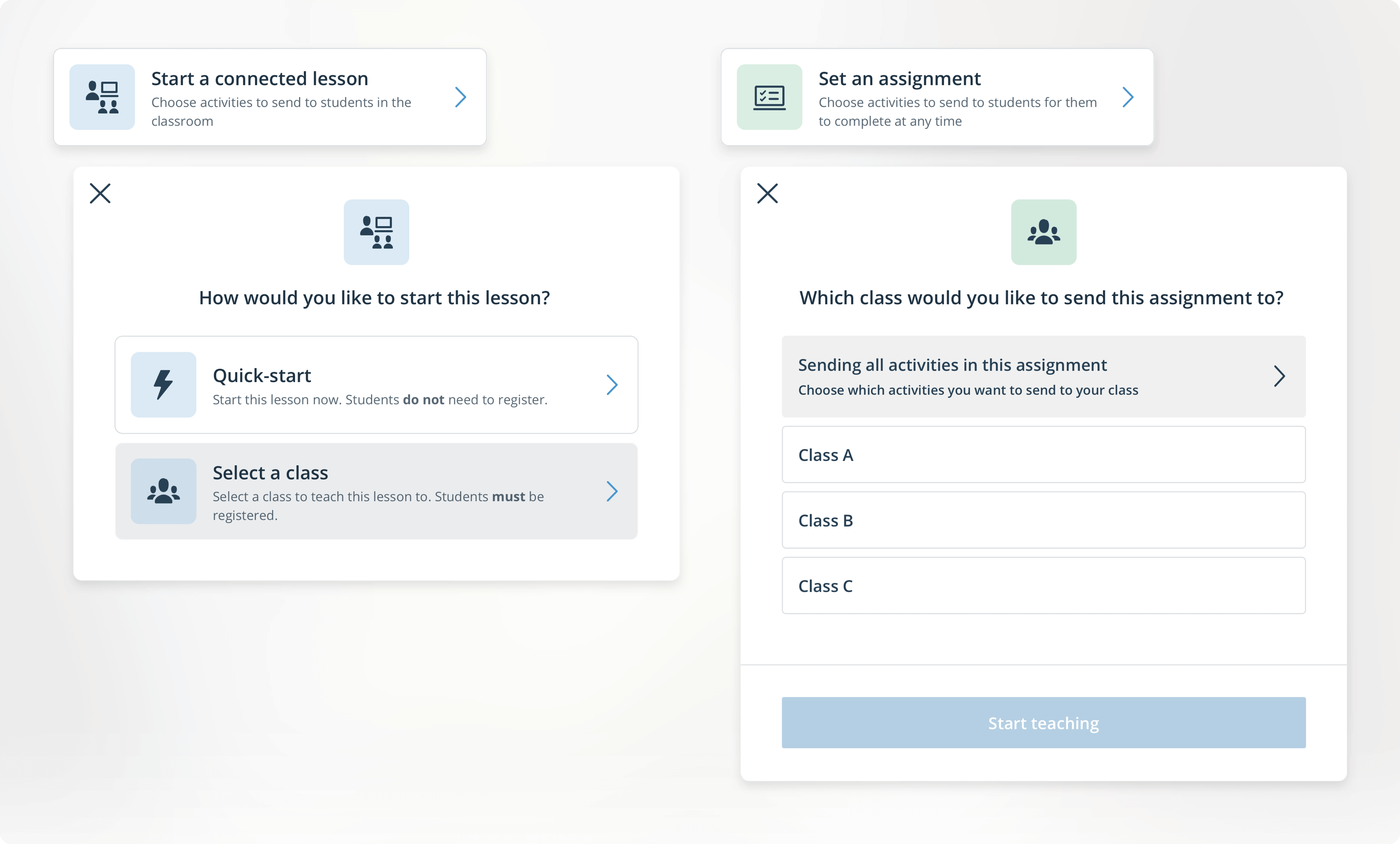
With two options currently in the product, and the need to introduce at least another two over time, we had to think about how we’d explain each step to our teachers. Some actions were jumping off points in themselves, like Quick-start: there’s no class-selector here, so you click that bad boy and you’re in a live lesson, whereas others were clickthroughs to the second or third part of their flow – so we had to cater for all scenarios in a way that informed the user what the hell was happening on their screen.
Our usability score went through the roof, and anecdotal data followed this. The people we tested with in person showed confidence navigating their way through the flows, and more or less all commented on how useful the small pointers at each stage were. Pretty banging stuff for a couple of weeks’ work. We shot all the copy through our academic team to make sure we were doing ourselves justice, and told the developers the final changes to make with icons, colours and the like. Proper designer lark, that.
Employing small tactics within the UI, like the iconography representing the stage of the process you’re at while the colour represents the particular path you’re on (in this case, start as a Live lesson vs. Send as an Assignment) helps the user form an understanding of what’s expected after just a few uses.
As this changed behaviour in a few areas of the product, it also gave us a rare but hugely appreciated opportunity to update our empty states and copy across different touchpoints:
We settled on a friendly little series of modal wizards, preempted by two simple options: “Do ya wanna teach this in a class, or make ‘em do it at home?”. We coupled this with the much friendlier “Teaching options”, to create the idea that just maybe you had some choice here, instead of “Start teaching”, which we all agreed was mean and made us sad.
To be honest, this step was the easiest, as we had more or less worked backwards and fleshed out the very simple flows and BDD before I even put pen to paper. But thanks to the wonderfully embracing nature of the squad developers, I was free to think a little more openly and pitch a bunch of new components that would guide a lot of touch points in EF Class out of the 90s.
Using a mixture of simple UI tactics like rounding our corners made this former cliff-edge a lot friendlier and helped us add more modern choices to our wider design system, while changing the copy and action on this button to take it from an anxiety provoker to a helpful hover-state that keeps users informed massively reduced tester uncertainty significantly.

Building this hover-over dropdown gave us a great opportunity to add some new, friendlier UI and micro-animations to our wider library – things we’d be reusing even during this project
Taking our formerly rigid colour scheme and pastel-izing it a little let us make every step here just that touch friendlier. Sprinkling that with more small details, like making it clear which stage of the process you’re at by following your path with colours and icons, make all the difference when subconsciously educating users about the product. Coupling this with taking their attention at the right time, to make it easier to understand what’s happening and what actions are required, left testers and subsequently our users feeling much more confident in their choices.
Alright, man, You've been talking for ages and I want to see if this worked so I can get on with my day
Fair.
More often than not in product design, you find yourself in a task where the objective is the move the numbers by 2%, because the design is fairly optimised and you need to make tweaks to see improvement. We didn’t really have that luxury, and besides, a drastically helpful change like this was bound to move our numbers a little more than that.
In my mind, I was betting on something closer to 15%, which would give us indication we’re going in the right way, and still provide a huge bump in completion rates of our core loop. It’d give us something to show, and something to work more on. Pretty good, yeah?
Would'ya look at those numbers? ?
Try a 28.49% increase of teachers registered in a six month period teaching their first lesson. Across 6 months, this one seemingly small change managed to shift our number from 1.1% of registered teachers clicking that button and teaching their first lesson, all the way to 29.6%.
To this day, I’m staggered. Yes, the work was great, and it’s a celebration for the whole squad that we shifted it quite so much, but it’s almost comical how such a small oversight was costing us 28.49% of teachers from completing the core loop.
Apart from this, the work allowed us to componentise a ton of legacy stuff like our modals, something coded by Noah himself on his days off from building the ark, meaning we could roll out tons of improvements in so many other places in the product in a matter of hours instead of months. Not only that, but more locally it gave us the freedom to roll out other features in this space, like Quick-start (seriously, read the post about it here) and Projection.
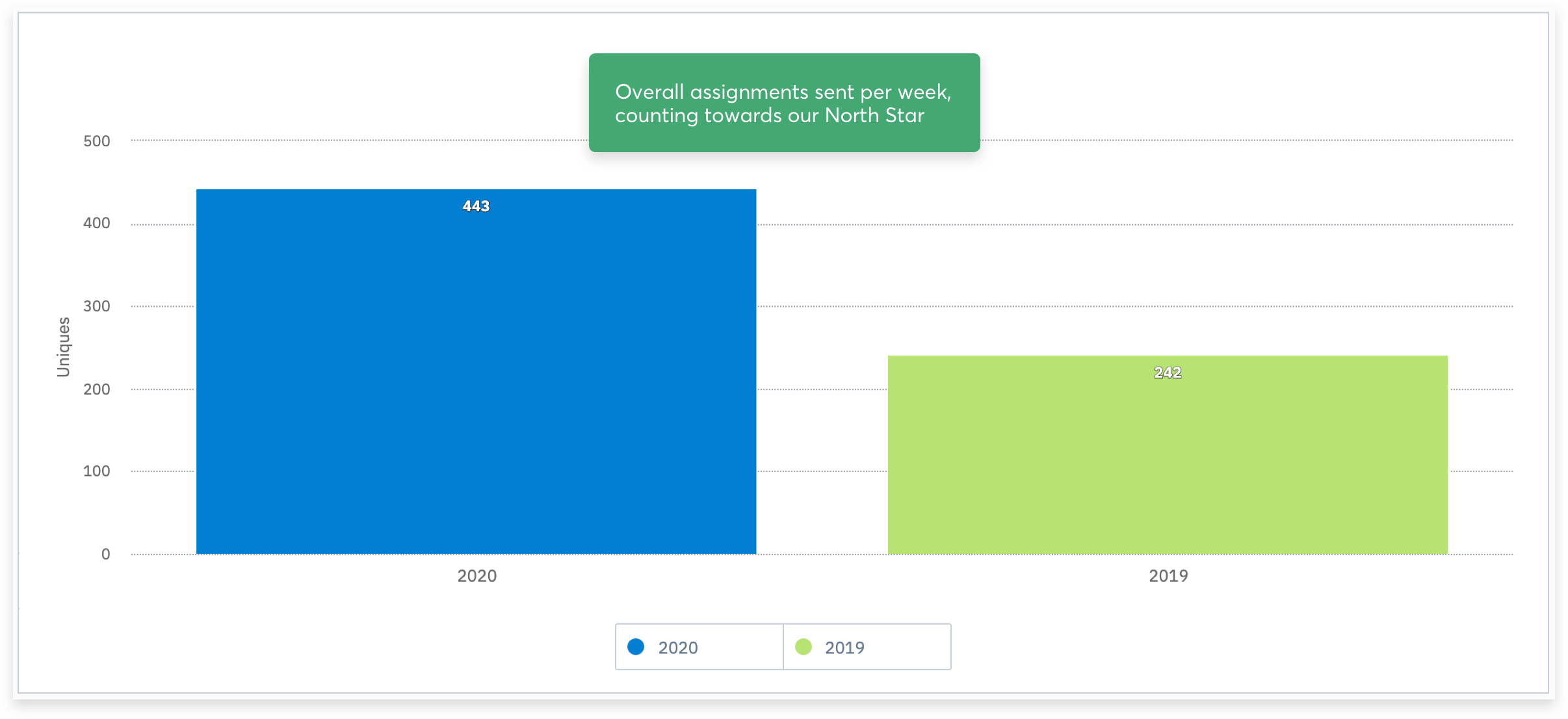
Our weekly average of sent assignments across the same six month period as before also saw a huge spike
Also, and this was part fluke, part “we definitely meant that”, in doing this we uncovered a ton of Assignments users who likely never knew about the option before. Don’t get me wrong, this was part of the problem statement in the first place, but making it accessible instead of impossible to understand shot the numbers for this through the roof, too.
