Nobody asked. We listened.
Part of a series on how we use user insight in the LendInvest Product and Design team, this time focussing on the surprises you sometimes find trying to research a totally different hypothesis.
About the project
LendInvest is one of the leading FinTech companies in th UK and an alternative lender in the property markete, providing finance to individuals and small companies with over £6bn. lent to date (Q4, 2023). The current LendInvest offering spans short-term lending such as bridging loans, residential mortgages, and buy-to-let mortgages.
Following on from the launch of our brand new Mortgages Portal covering our entire product offering, we set ourselves the task of diving into our data in order to figure out how best we could spend our time further improving the logged-in experience for our brokers.
Emerging from this period of ‘get it done’ work – where we spent the best part of three years bringing our mortgage application technology in-house – we finally had our three distinct products joined up in the same platform but no real eye to how it was being used (besides very high-level data such as the number of applications submitted).
The big ‘oh crumbs’
Initially this project began as a means to find the average time it was taking a broker to put an application through each product, see the key blockers, and figure out how we could make those bottlenecks seem a little less tight. However, something much worse quickly became apparent; our application flow front-end was breaking left, right, and centre.
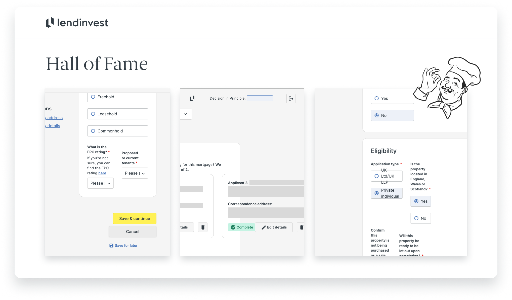
You see, we thought we’d been clever. Proper shrewd. At the time of building out the application flows for our products we had opted to focus entirely on a desktop experience in order to save time. We knew this was a project we’d come back to eventually, but it was more important as a business decision to have something in the market rather than spend even more time making it work for an audience we couldn’t be sure we’d have.
When we launched our new Dashboards and Overview screens, we had made it very clear these were responsive all the way from the smallest devices currently sold through to the comms console on the Starship Enterprise. Whenever you need it, wherever you need it (Shakira, Shakira). We’d also thought we’d worked around this – at least in the short term – by introducing a blocker to prevent folk from starting anything at a resolution we didn’t support:
This is the ideal mobile experience. You may not like it, but this is what peak design looks like.
Still, we were seeing lots of users beginning an application at a resolution we supported then minimising their window. At the time we speculated this was because brokers would pull up their fact-find docs, or CRMs, or however they managed their clients’ information – something which was later confirmed when we observed this behaviour during visits to brokerages.
A slide of just some of the dynamite findings that I presented back to the Product team.
Learning more
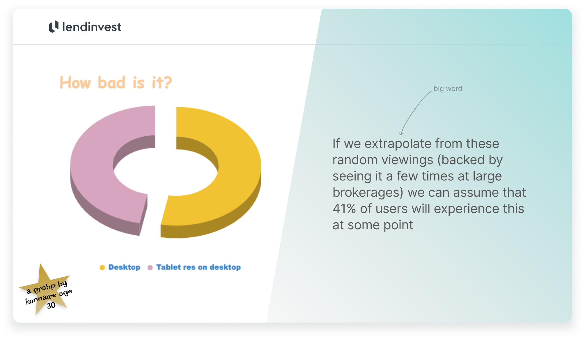
So we dug a little deeper into our funnels. Across 63 randomly selected logged-in sessions where the number of events >200* (backed by seeing it in person a few times at large brokerages with a better than average tech setup) we extrapolated that 41% of users will experience this at some point. Not good.
Highly professional findings I was happy to present back to some 200 people.
Being responsible with our responsiveness
For every proposal one must balance business requirements with the needs of the user and the feasibility of the solution. Luckily, one of the main business requirements is our customers being able to use our tech.
Working with Ellie (our Lead Salesforce Engineer), Ida (a Senior Product Designer), and Nathan (Business Analyst) we quickly figured out the effort this build would take and a way to roll out a series of improvements across a few months. Doing so would allow us to continually measure our changes and present our users with less drastic changes, working towards the goal of a truly responsive experience from first impression to completed loan.
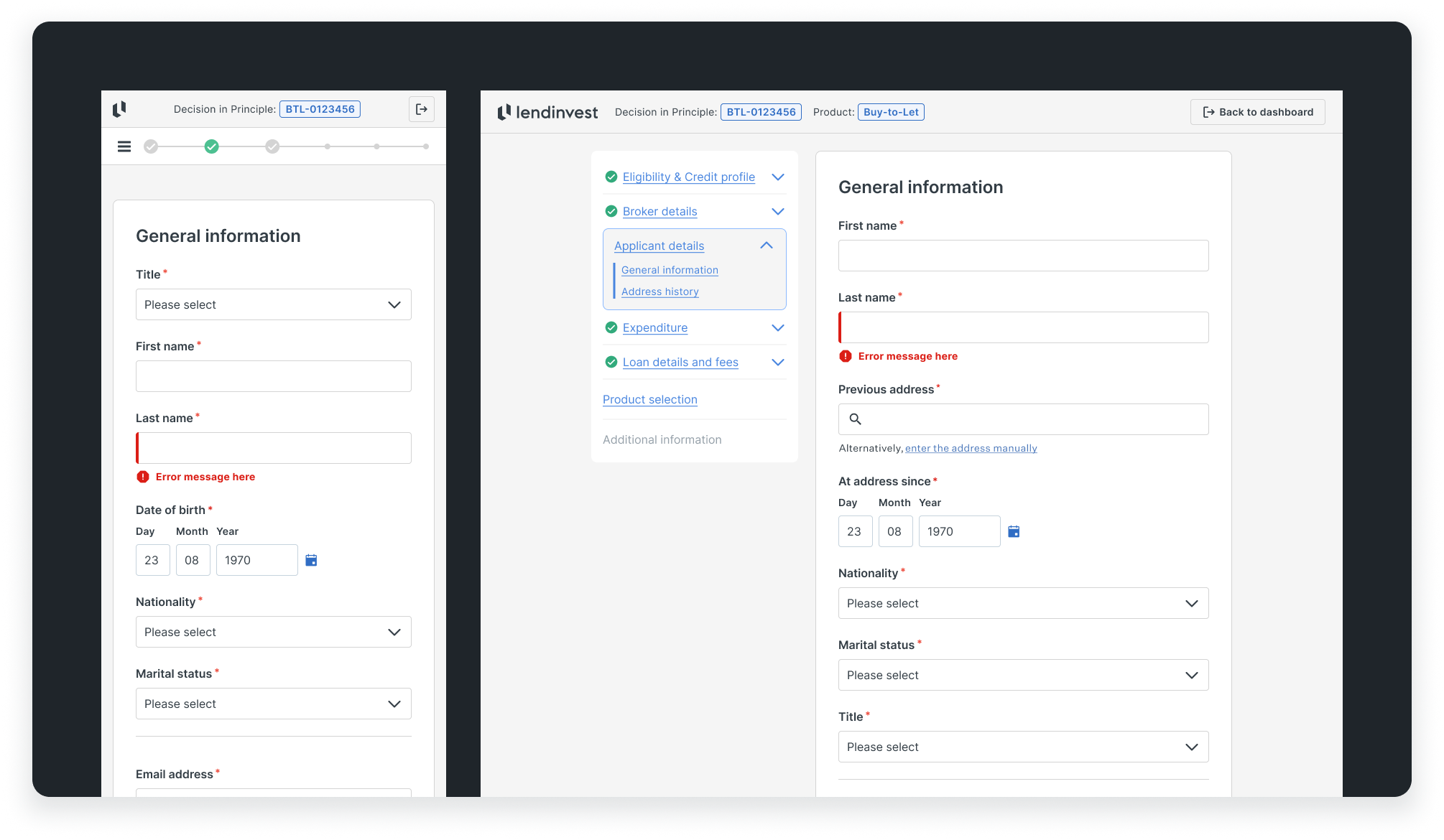
An example of our final state application flow, usable from mobile to IMAX.
Accessibility: Lower cognitive load, better for assistive tech
Single-column always trumps multi-column forms, whether it’s across usability, accessibility, confidence or maintaining less tech and design debt.
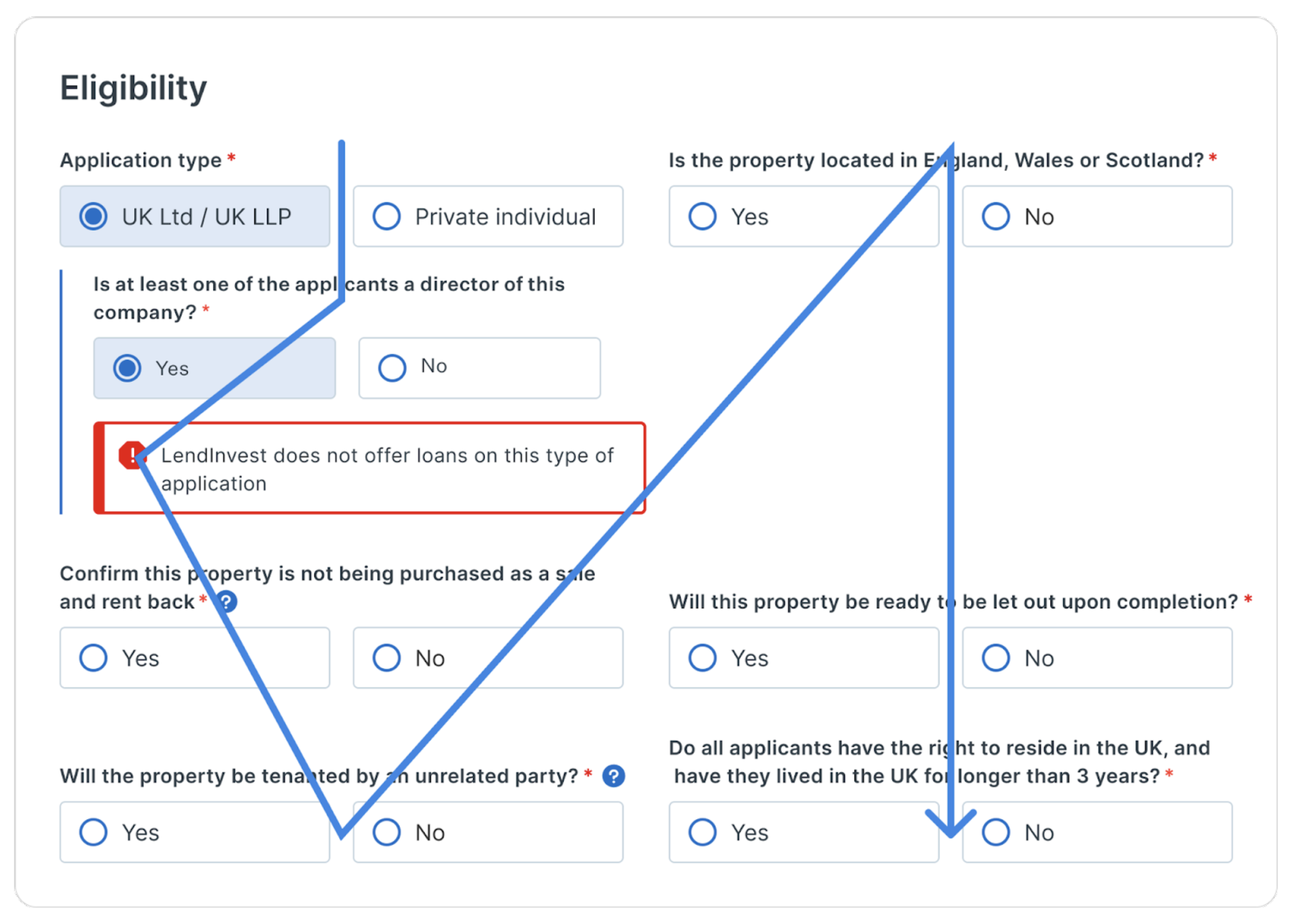
This isn’t anything new, but helped form a case to move away from our original layout where we tried to jam as much in as possible to save vertical space. Anecdotally, I’ve sat in tens of user tests where it’s proven easier to complete in-line forms. To back this up, CXL ran a study across 702 users where they found users took 15.4 seconds less to complete the same form (although they don’t specify how long it was).
As a user, I’m not sure where my attention should be. Why are random fields expanding? Why are there suddenly huge white spaces?
Ultimately, single-column inputs are tidier, giving us the option for inline suggestions, help, or errors. They allowed us to group questions a lot more simply and made labels easier to scan. This all results in a lower cognitive load for the user with a clear order to fill the form, introduces much less tech and design debt, and provides a better experience for people using assistive devices.
Measuring success
One of the two key metrics here was still the average time it would take a broker to submit an application across all products. More on that to come as we roll this out over the next few months.
A more direct metric was also to be the number of brokers seeing a battered experience – if done correctly, this should be 0% and a big green tick upon launch.
Mine’s a pint.


